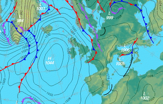
Wednesday, 11 November 2009

Mailer

Howdy hi! I'm currently in the process of tidying up recent university briefs. It's good to approach old projects with fresh eyeballs.

Here we have the first brief of the year, experimental typography. I have re-designed my mailer and also made it larger in size, which will be exciting when printing! I dropped allot of information off the mailer and put it all into a cover letter (too boring to blog however), that would be posted along with the "limited edition poster."

The "use me!" type at the bottom of the poster is actually going to be cut out of the poster, to hint at the method that I used to create these letterforms.

Cutting out information from the original layout has enabled me to concentrate solely on the letterforms. I've tried to emphasize the name of the typeface (Resonance) through the placement of the letters. I've found it interesting trying to think of alternative ways of laying out the alphabet! I'd never considered the alphabet in a non-linear way.

It'd be great to hear what you think about this piece, I still have a few days before the work is palmed off for assessment!


(Cheers Robbie on the Trade Gothic issue)

Monday, 26 October 2009

Eggness

For some reason or other I've taken to drawing on egg shells recently. I got duck eggs and found something interesting about how brilliantly white they were, think they just immediately screamed "canvas" or "draw on me," at me.

Its quite relaxing to do, as you have to concentrate on not being too heavy and also on not smudging the ink, which I heavily failed on. I'll get better at it though.

These are the first couple I've done but I have more plans for the other 4 that i have left in the box...I also have planned how I am going to eat the other 4 left in the box.


Remember the bits of lego that were hair? Thats what this one reminds me of!


Lovingly placed on an old issue of grafik (which was lovingly stolen from a housemates bedroom-he'll get it back).

Saturday, 24 October 2009

Another little slice of new work

Here is a screen shot (excuse the lines running through the pic), of some experimental typography I recently completed. I had to create as much of a letter set as I could and then design a suitable mailer to send to various agencies/studios. Im pretty happy with my final letterforms, however, my mailer needs slightly more work before I will be content...hopefully that won't be long and I shall post up the final mailer.


Some New Work

I recently finished re-branding a local Cumbrian company called Larch Cottage Nurseries. These are my final logos for the company, which consists of the nursery itself, a restaurant and an art gallery. Obviously, these three areas are completely different, so I decided to link them together with a simple type treatment.

I used University Roman for these and tidied it up a bit so that the type would sit a bit more comfortably. I also added small bits of foliage to include the organic, natural feel of the company. These pieces were only to the letterforms which I thought could allow them, that is, the R and the S both (if you write them manually), have a natural flow to them.

Enough of the waffle, here are my logos, comments most appreciated.

Tuesday, 13 October 2009

Excitement!

Tom Waits - Glitter and Doom Live from Anti Records on Vimeo.


Can't wait for this! Plus it will contain a disc full of Tom Waits stage antics...that is, his amazing story's.

Ive neglected the blog for some time now. I shall be changing that all soon though and updating more often.

I promise!

Tuesday, 15 September 2009

Bridges Skatepark

Belfast recently got the go ahead for a skatepark, which is great news as it has been a long time in the making. I saw a notice for a competition to design the logo for the park and felt that I had to try and come up with something.

This is where I am at the minute with the logo. I have concentrated creating letterforms using ramp silhouettes. I also liked the idea of using the negative space to create something, as it is kind of how you could look at the build of a skatepark, turning unused spaces into something better.

Id really like to do well in this competition so any feedback would be great! I guess as long as it resonates with the skate community I should be ok.


Monday, 14 September 2009

Disabled Parking Spot?


Does this count as a valid sign? Its so wrong that it took me a moment to figure out what it was telling me!

Its interesting to think how far you can get it wrong and still convey the information.